The DonorQuest Dashboard offers a live view of what's going on in your donor database from minute to minute. All of the displays within the dashboard are updated in realtime, so you may simply leave it open to continuously monitor the information which most interests you. The dashboard can be kept open along with other DonorQuest windows, allowing you to do your normal activities in DonorQuest while still monitoring events. It can also be resized to suit your preferences and to fit nicely with whatever else you may have open in DonorQuest. Any preference changes you make to the dashboard will be saved under your user account, allowing you to have your own customized dashboard.
The dashboard display consists of grids and graphs. Some are donor-specific, and others are more statistical in nature, showing realtime totals across many donors. You may open the DonorQuest Dashboard at anytime by clicking the icon for it on the DonorQuest toolbar, which looks like this:
Here is a brief overview of the various displays within the dashboard:
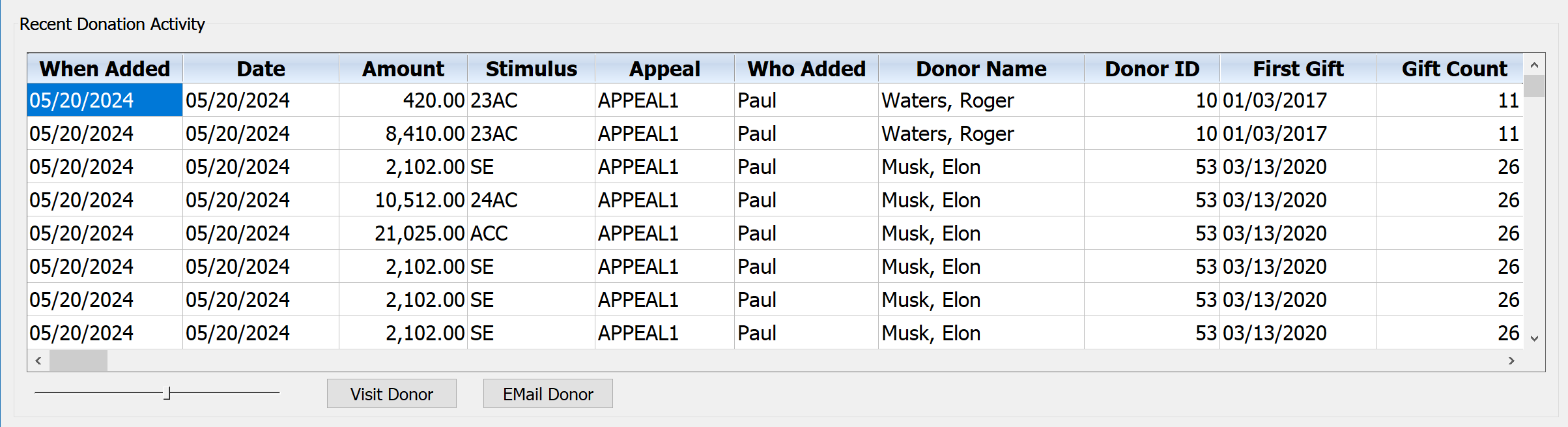
Recent Donation Activity
The Recent Donation Activity display is a running track of donations as they are entered. If you have multiple data entry people at work entering (or importing) donations, you will see them here as they hit the database. Below the grid are some controls - a horizontal slider to control the font size of the grid, and a couple buttons. The Visit Donor button will automatically position you at the donor's record in the main data windows so that you can see full details about any of the donors who just had a donation added. The dashboard window will stay open alongside the main data windows so that they may be used in combination. There is also an Email Donor button which will allow you to compose and send an email right on the spot to a donor if you wish. If you are a campaign manager and you happen to know a donor who just gave a large gift, you could thank them immediately and personally! In total, the Recent Donation Activity grid has the following columns: When Added (actual date donation added), Date (date assigned to donation), Amount, Stimulus, Appeal, Who Added, Donor Name, Donor ID, First Gift, Gift Count (lifetime), Life Total, Address, City, State, Zip, Phone, Primary Email, Donor Type, Fund (for donation), Type, Account, Thank-You Letter Code, and Comment. Here is what the Recent Donation Activity display looks like:
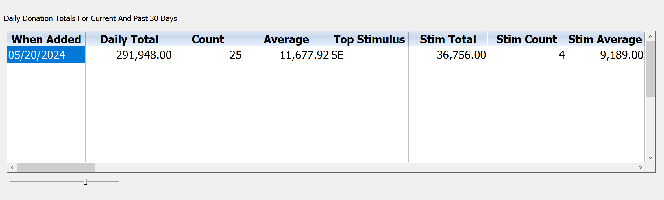
Daily Donation Totals For Current And Past 30 Days
This dashboard display is intended to give you a summary of daily revenues for the current and past 30 days. It provides a quick way to get a handle on your day-to-day entry volume and revenues. It shows a daily total, gift count, and average by actual entry date (not the given donation date, though they are typically the same). Also shown is the top stimulus for each day by revenue, along with a gift count and average amount for the top stimulus. Here is what the display looks like:
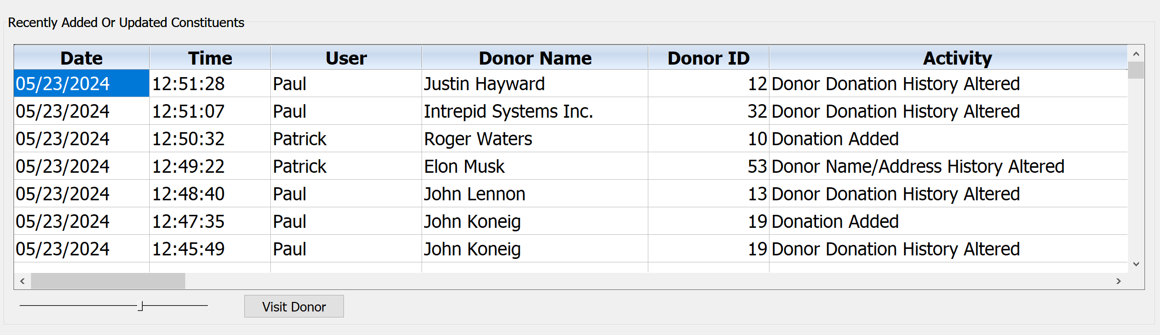
Recently Added Or Updated Constituents
This dashboard display will show you all user actions affecting constituent records in realtime as they happen. If you need to investigate an event in more detail, simply click on the Visit Donor button. Here is what the display looks like:
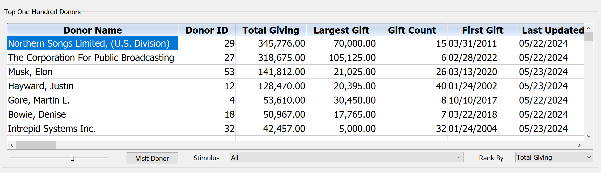
Top One Hundred Donors
Initially this dashboard display will show you your top 100 donors based on lifetime giving. But using the Stimulus selector, you can monitor your top 100 donors for a specific stimulus code. There's also a Rank By selector which allows you to choose between Total Giving and Largest Single Gift. This is used in combination with the Stimulus selector to filter the donors who makes it into your top ten list. You may also order the display by any column by clicking on the title for the column you wish to order on. Clicking repeatedly will toggle between ascending and descending order. There is also a Visit Donor button which you may use to view all information about a specific donor via the DonorQuest Main Information windows, which can be open at the same time as the dashboard, working together to keep all information at your fingertips. Here is what the Top One Hundred Donors display looks like:
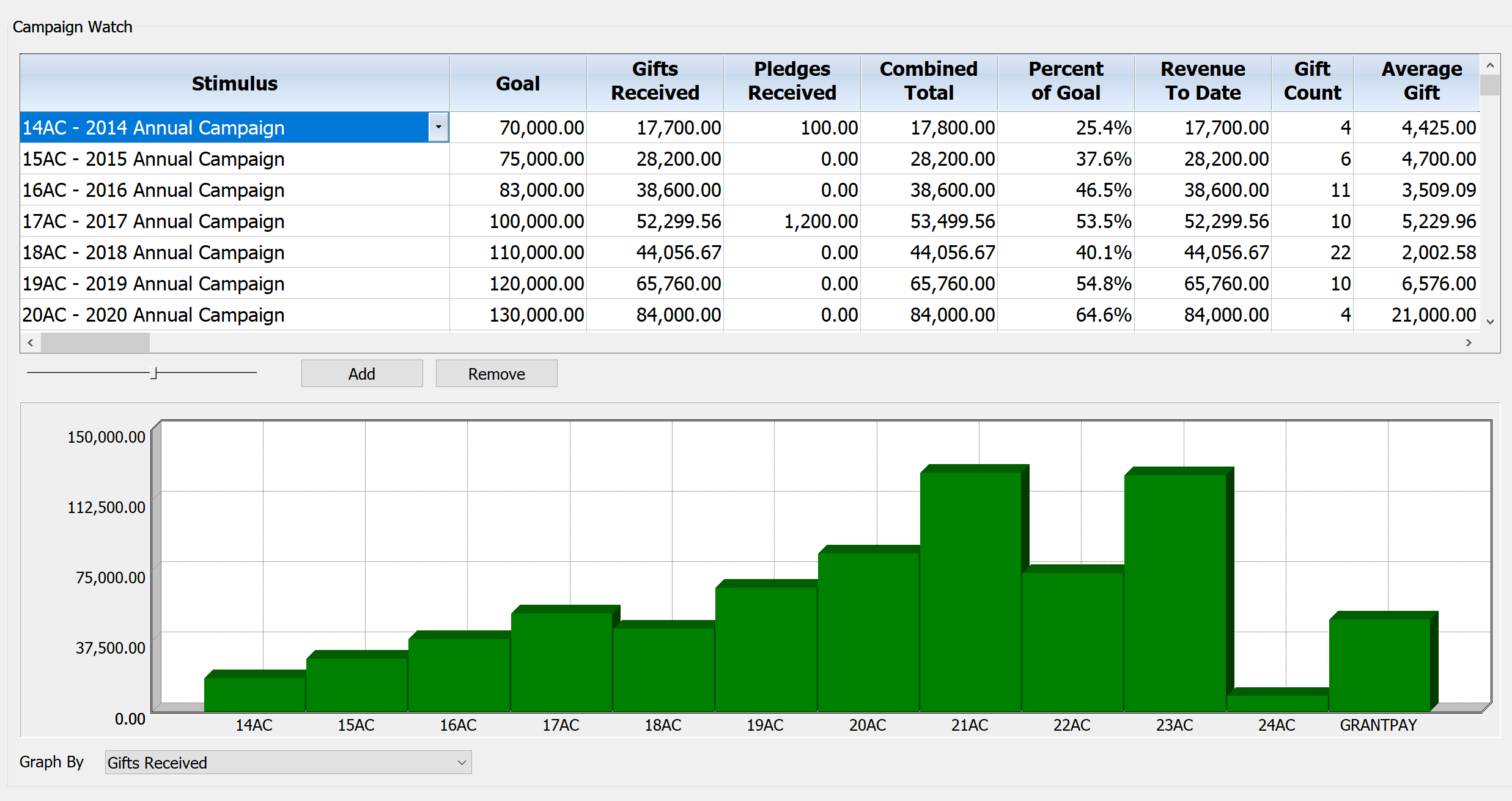
Campaign Watch
The Campaign Watch is a combined grid and graph display showing campaign (stimulus) totals. Note that campaigns are driven by stimulus codes in DonorQuest, and there is normally a one-to-one correspondence (so when you see Stimulus, just think Campaign). The graph is linked to the grid so that any changes you make to your preferences in the grid are immediately reflected in the graph, including when you order the grid in ascending or descending order by any of the columns. You may use the Add and Remove buttons to add or remove rows from the grid, and the drop-down arrow in the stimulus column can be used to change the stimulus being monitored. After adding a new row, you need to select the Stimulus it should display information for. Directly below the Campaign Watch grid is the companion graph, showing totals by Stimulus. The horizontal axis of this graph will always show all chosen Stimulus codes from the grid, but you may control the vertical axis via the drop-down control you will see beneath the graph. This control will let you graph by any of the numeric columns of the grid for each Stimulus. Specifically you may choose to graph by Goal, Gifts Received, Pledges Received, Combined Total, Percent of Goal (achieved), Revenue To Date, Gift Count, Average Gift, Pledge Count, Average Pledge, Combined Count, and Combined Average.
Feel free to customize the display as much as you like since all changes are saved under your user account. This allows all DonorQuest users to have their own custom viewing preferences for all dashboard displays without interfering with the preferences of other users. Here is what the Campaign Watch display looks like:
Appeal Watch
This Appeal Watch display within the dashboard is just like the Campaign Watch display, but deals with Donation Appeals instead. Otherwise it has the same grid columns, corresponding graph, and functionality.