Reports, Graphs, Donation Graphs
Donation Graphs in DonorQuest are designed to give you the big picture of how your organization has been doing over time. The graphs look at total revenue and gifts counts for your organization over a time span, at uniform intervals of time within that span. You can set both the overarching time span, and the intervals of time within the span, and the graph will interactively redraw itself. To view the standard graph, click on Reports, Graphs, Donation Graphs, and you will see a display similar to this:
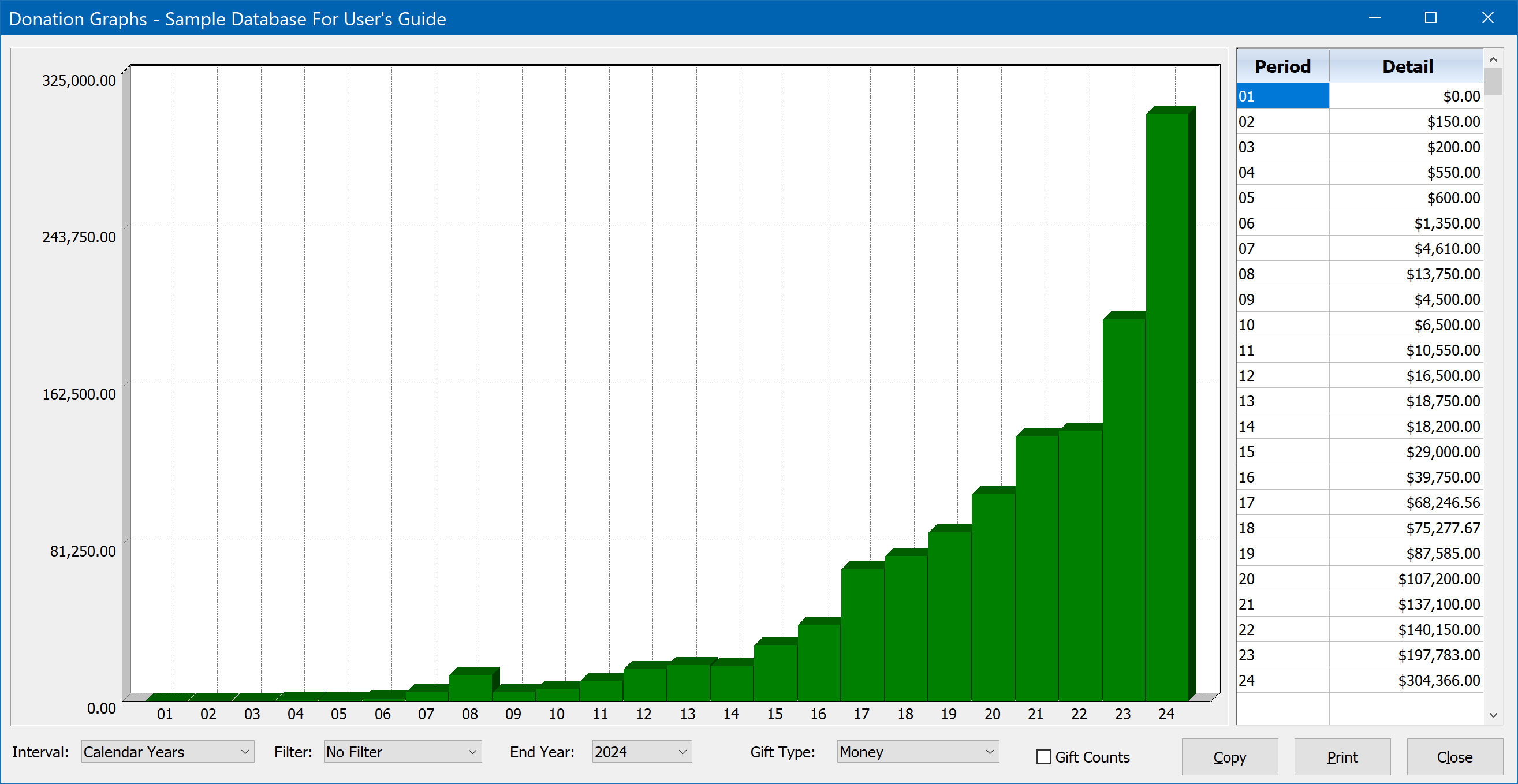
When first opened, the graph will show the default display of a twenty-four year time span, with total revenue broken down by calendar years. You can change the interval to be fiscal years, months, or weeks. The ending date of the graph may also be set to any date you wish. For example, if you set the ending date to 12/31/2008, and keep the interval at calendar years, the graph would cover the years 1984-2008. Or if you set the ending date at 12/31/2015 and set the interval to be months, the graph would span two years, showing 24 monthly revenue totals. In addition to monetary totals, using the Gift Type control you may also choose from one of the many Alternate Unit donation types DonorQuest allows (such as hours of time for volunteers, or pounds of food, etc.)
You also have the option of graphing gift counts instead of amount totals. This is done by checking the box labeled, "gift counts." You may toggle back and forth between the gift total and gift count graphs to see the relationship between the two. This can be very revealing. For example, you may find that in some years, while the total revenue was about the same, one year saw a much larger number of gifts going into making the total. That will tell you that for that year, your campaign efforts may have brought in more gifts, but not really anymore revenue. So you would then want to review the campaigns you ran in the lower gift count (but equal revenue) years. Since the revenue was the same, that will tell you that the campaigning for the lower gift count year was actually reaching more affluent donors, and perhaps you should refocus your efforts there again, since a gift count boost there would be far more valuable.
The donation graphs may also be driven by a donation-based selection result. This allows you to filter the donations included by any conceivable condition or set of conditions. To graph a donation-based selection result (one built from the donations table), open the Selection Results window, highlight the donation result you wish to graph, then click the Graph button you will see on the left side of the Selection Results window.